Saturday, 31 October 2009
With coulours
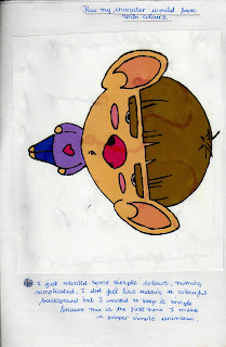
My character with some colour on it.
Just simple colours because this is the 1st time I make such animations.

Tips learnt from my previous projects
- What I have realized today is that I when I draw and animate something, it tends to grow bigger everytime.
- After drawing the keyframes for this project and filling in the gap between them realized that the animation keeps its original size.
- So now each time I make an animation I have decided to dawthe keyframes to keep the same size.
- Sometimes it doesn't only grow bigger, it moves sideway as well.
Different exaggerated expressions
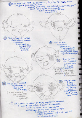
Now that we have a character, let's try to apply some different expressions to it. For instance Neutral, smiling, surprised, sad or even a puppy face
And let's try to exaggerate these expressions to the maximum.
 After fnding exaggerated images I'm going to make a storyboard
My final morphing project

The first morphing project did not look like it was exaggerated, It was hard to stretch the character's face, so I have decided to create a character of my own (A character more suitable for the stretching and squashing that is required in this project. At first I was going to create a human face or an animal, then combined both and it gave me this character.
I think this character is OK (Maybe I should raw him with some pointed ears just to make it look more like an animal rather than a human).
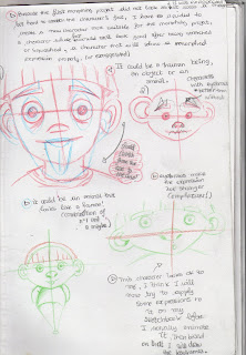
I will now try to apply some expressions to it on my RVJ before I animate it, then based on that I will create a storyboard which will include the key frames and what must appear in between.
Friday, 30 October 2009
Exaggeration Test 1
As you can there is no exaggeration at all because I do not know how I can possibly exaggerate such face...So I think I might create another character more suitable for this project and I will apply the same expressions I tried to apply on the first character.
Expressions for the exaggeration project
I took pictures of myself wearing different expressions just to help me get ideas on how each expression might look on my character.
The exaggeration animation Task Part 3
A rough a sketch of how my character would look if animated it with an angry expression (From a neutral expression an angry one)
The exaggeration animation Task Part 2
Here are some facial expressions of real human beings and here is how I would actually animate my character, which expressions I'm applying to it.
The exaggeration animation Task
Now I have to pick one of the drawings made in the exaggeration exercise and refine it into a simple design suitable as an animation production drawing.
One rule I learnt in animation is that the simplier the lines are the easier it will to animate and you have less chance to make mistakes.
Since the drawing I chose had to much shading in it, I have decided to get rid of the shading and animate a plain character.
One rule I learnt in animation is that the simplier the lines are the easier it will to animate and you have less chance to make mistakes.
Since the drawing I chose had to much shading in it, I have decided to get rid of the shading and animate a plain character.
Exaggeration Project Part 3
Here are more exaggerated expressions:
Surprised or shocked expression, here is how I would draw it:
Bigger eyeballs than usual, higher eyebrows and an open mouth for more effects.
And here are some other squashed faces that you can compare to th eoriginal drawing just to see what was exaggerated.
Surprised or shocked expression, here is how I would draw it:
Bigger eyeballs than usual, higher eyebrows and an open mouth for more effects.
And here are some other squashed faces that you can compare to th eoriginal drawing just to see what was exaggerated.
Exaggeration project-Part 2
Here are some other simple exaggerated faces.
I did another one for the skeptical expression, this time around you can see the character's entire body and it seems smaller than the face (Another form of perspective view).
One for a sad expression, the eyes look big and watery (glassy effect I would say like He is about to cry) or maybe like a puppy face.
Another version of a sad exaggerated expression, this time the character's mouth corners are pointing down on either side of his mouth. (This gives a stronger sense of sadness) when combined with the glassy look I Think)-This is more suitable for a sad expression than for a puppy face one.
I tried to draw a really exaggerated hppy face, as you can see th enoose is wider, the face is squashed rather than stretched and the character's has got a wider mouth.
Exaggeration Project
Visually exagerate portraiture of either yourself or friends...Will need to do a quick series of sketches first
(I will need to make sketches of How my friends or I look in real life first) then exaggerate the faces--- I will try to stretch their faces first just to see how it would look.
I have decided to choose Richard and exaggerate his face.
Here are some sketches.
There is the orignal face of the person, then how it would look if he was angry or skeptical.
If he is angry, I cannot really stretch his face so I just make his eyebrows look bushier and thicker to emphasize his frown, if he is skeptical it's good to give him a perspective view, raise an eyebrow and make the other eye look like it's slightly closed. (The idea of Thick pointed looking eyebrows was based on how Wolverine hairstyle looked)
Subscribe to:
Posts (Atom)


